Monday, July 18, 2016

An Artist Teaches


Yesterday I drove to The Weisman Museum at Pepperdine University to a talk and demonstration by one of my art mentors, David Leffel. The drive itself was a landmark for me as I fear LA traffic! I found the traffic doable on a Sunday and actually, I'd only driven to Malibu - which locals will tell you is not LA. What?!? To me, LA kind of goes on forever! Anyway, the talk and demo were the types of things my bucket list is made of. Priceless! 
Below are some highlights and quotes from David's talk:

When painting, "more to less" variation.
Do not be too specific too soon.
Leave doors open to possibility.
David uses highlights to direct the viewer's eye.
"Create a lot of nothingness to make the something more important!"

When painting backgrounds:
Warmth creates depth
Coolness creates flatness

When painting foregrounds, it is the opposite!
Warm colors bring forward.
Cool colors recede.

To render is to illustrate. 
To paint is to sculpt.

"The more transparent the shadows, the more it makes an object lift up".
"The light designs".
"The technique is not as important as the intelligence behind the brush".
"Be aware of people in the portrait first, and that it is a painting second".
"Have a concept first and put the pieces into the concept". 
"Orchestrate what you are seeing into a visual delight".
"In a good painting, there's a dialogue...unfinished, finished....this is so the viewer can read into what the painter has left undone".
"5/8th finished is your goal. Leave 3/8th of the painting to the viewer to finish".
David has not favorites in subject matter. It's all about the struggle of effectively putting paint down.
"When the stomach is full, the head is empty".
"Every painting is a self portrait. It is a portrait of the intention behind the painting".
In each painting do self examination. Understand what you're looking for. Hone your technique, but be clear about your intention and get THAT into the painting.

Sunday, January 17, 2016

Making a Splash!

Here's the painting so far. It's almost complete but I need to put it aside for a week as the paint is slightly dry and getting tacky (not good to keep going at this point). I'll look at this under different lighting and think about what else needs to be done. Two areas that I'll be concentrating on are: Value corrections and details in focal areas.
A warning to myself: Don't overwork this! I want this bird to give the impression of taking flight, not feel tight. Another reason to set this aside for a few days.

Wednesday, January 13, 2016

A Work in Progress


I thought I'd share a work in progress. I enjoy sharing my process but this is not for the faint of heart as most of my paintings go through an adolescent phase from hell! :-0  With oils I enjoy starting loose, very loose with a watercolor underpainting(see above) as this first step helps me visualize my finished painting and I find it relaxing. It also helps me check my composition, drawing and value patterns. This step can also be done with oil and turpentine, but I used a light wash of watercolor here.
In the top photo you can see the original photograph from a generous photographer/friend of mine (thanks Don Anderson!), along with a small value sketch. If you look at the actual painting (top) you can see where I've drawn grid marks lightly on the canvas. This is how I check my drawing to make sure my proportions are correct. Not much worse than getting 3/4 of the way into a painting and then realizing your basic structure (or drawing) is flawed!
The background is not finished but this feels like a good start. I've loosely blocked in the swan- don't get scared! The marks I've made are mostly for landmark purposes and how I begin to map out darker values.
OK, after posting these scary photos I'd better finish this in a few days, huh?!? I'll post the next or finished photos as soon as they're completed. Thanks for viewing!

Monday, November 23, 2015

Studying some masters

Hi!  I'm working on a a series of paintings that will not be published until they are nearer completion.  I'm excited about this new venture and have been studying/painting away. It's hard NOT to share each step but for now I will upload and share what I'm doing as I take short breaks from my series.

I'm keeping my balance by choosing a few older paintings that 'weren't quite right' and tweaking them. My aim is to ether cure or kill these paintings. Why? Well, why not?!? Let's see if I can salvage a few of these.

This example was obviously inspired by VanGogh. I admire this artist's work and enjoy studying his style, color and brush marks. The top painting was my first attempt at some flowers I'd picked from my yard. I liked the energy of the brush strokes, but MAN, those colors were yelling at me. They were saying "Lay OFF the caffeine Karen!". Below I've dulled the background colors, trying to keep with my initial idea of energetic brushstrokes. I enjoy painting this way. Less thinking and more from my heart.

Monday, August 31, 2015

Traveling Buddha

Second attempt at Buddha is heading south quickly! :-(
This brings to mind the most popular question people ask artists: "So, how long did it take to paint that?" I wonder if observers really want to hear about the hours of practice runs?!?
Actually, I'm going to let this painting simmer tonight and in the morning may do some experimenting with this. Sometimes it's nice to 'give up' on my painting as it frees me to experiment. I've pulled a few of these out of the gutter. It's alway interesting being an artist!

Monday, August 24, 2015

A Video Worth Watching- Joseph Raffael

Hello! Thought I'd share a calm and inspirational watercolor video. This watercolor artist has been a favorite of mine for years. Joseph Raffael is a contemporary watercolor artist. American, but lives in the south of France. Love the music that also accompanies this video! Relax and enjoy!

https://www.youtube.com/watch?v=DdKFl6QyIGA

PS He's also got a fantastic book you can get on Amazon titled: Reflections of Nature: Paintings by Joseph Raffael

Monday, August 17, 2015

Demos from Hope's Watercolor Workshop


Hello! Here are two workshop demos. I think I'd title the top painting something like "Who Says Sunflowers Have To Be Yellow?!?"
The bottom painting is unfinished, yet I believe it says what it needs to say. My point is that many times in art, or watercolor, less is more! :-)

I've had a few questions about the palette (or paint colors) we used in our workshop.  Basically, I used a warm and a cool version of each of the primary colors, plus a few others. These colors vary from manufacturer to manufacture. That’s all good, it just takes experimenting until you find the specific colors you enjoy. Some of my favorite paint companies (or manufacturers) are Winsor & Newton, Daniel Smith, Holbein & Schminke. However, there are several others that are also top quality. Here is the basic palette I used:

Aurelian Yellow
Cadmium Yellow
Alizarin Crimson or Permanent Rose or Rose Madder Genuine
Cadmium Red
Cadmium Orange
French Ultramarine Blue
Cerulean Blue
Burnt Sienna or Indian Red
Raw Sienna

Making Colors Sing by Jeanne Dobie is a wonderful book focusing on practical lessons in color and design. Jeanne shares fun lessons on mixing beautiful colors. This is available on Amazon.com

Let me know if you have other questions. Happy painting!

Friday, August 7, 2015

Beginning Watercolor Workshop

Hi! It's been awhile but updating my website and blog are on my 'I will get better at' list! 😉 I will upload photos of completed demos when I get back to California. Here is a list of a few things we've covered this week:

Supplies: Creative Coldsnow is the local art store on 25th & University in Des Moines. DickBlick is my online source.

Arches watercolor paper- rough, cold press and hot press. 140 lb is most common and what we used. Other good brands are Lanaquarelle and Fabriano Artistico. All papers react differently with paint. Some are softer, more delicate, some let you lift the paint easier, etc. This is a fun are to explore with!
Tube paints by Daniel Smith, Holbein and Winsor Newton.
Recommended brushes for beginner watercolorists-
1. Sable/synthetic blend. Round. #10. Please buy the best brush you can afford. This makes a difference!  My favorite round? Davinci Maestro Kolinsky Sable or Isabey Pure Sable.
2. Squirrel mop brush size 3. My favorite? Isabey 6234 Petit Gris size 3 or 4.
3. Hake brush (large inexpensive, flat brush used to wet large areas).
Kneaded eraser.
Masking fluid. Remember to use an OLD brush to spread this!
Smaller, old or stiff brush for lifting paint.
Large strait edge ruler.
#2 pencils.
1/2 or 5/8 "Gator board.
Paper towels.
Something to elevate head of your Gatorboard slightly.
Water container.

Artists who have great books or DVDs for beginning/intermediate watercolor students (this list could go on and on....) :-)

Birgit O'Connor- great DVDs!
Karlyn Holman- books and DVDs.
Jeanne Dobie- great book on mixing beautiful grays, greens, etc.
Shirley Trevena- fantastic books and DVDs. Inspirational!
Alvaro Castagnet- entertaining artist. Great books and DVDs.
Joseph Zbukvic- great DVDs
Jean Haines- great books and DVDs.
Vinita Pappas- great artist and teacher. Excels in plain air and landscape painting! Gives online classes and workshops. Has videos on Youtybe.
Des Moines Art Center has great art classes throughout the year. I've met wonderful artists, instructors and friends there.

YouTube has many clips and videos of these great artists.

Iowa Watercolor Society is a great organization and has fantastic fall workshops with world known watercolor artists who give demonstrations and workshops. It's a great way to learn and meet fellow watercolor enthusiasts!

www.iowawatercolorsociety.org

Happy painting!


Monday, January 12, 2015


 This past week I heard of the passing of one of my childhood friends. These orange roses seemed a perfect subject for my feelings. It gave me comfort to paint and absorb the fading beauty while reminiscing of times past.
Watercolor/gouache. The flowers and leaves are only watercolor. The vase, leaves and background were painted first in gouache, then I painted over the gouache with more watercolor in different hues. The gouache lifted a bit, making the background cloudy and mysterious.

PS Here is a beautiful poem written by another friend when he saw my painting. Thank you Ivan!
A soul has passed that solid grid we all deny with reverent respect to somber, undefined hereafter;  my friend, a floating blossom from a bouquet of life, a vase of ample nurture left behind.   

Ivan Volkoff

Monday, December 15, 2014

Color Therapy

This weekend created some Christmas cards. Watercolor and poinsettias work great together!


Sunday, December 14, 2014

Sunshine on a Cloudy Day

This painting was inspired by you Mom. It's all about color. Hope it brightens your day! :-)

Love, Karen


Saturday, June 14, 2014

Ring the Bells!!!


ring the bells that still can ring
forget your perfect offering
there is a crack in everything
that's how the light gets in
-leonard cohen

Recreating a Background

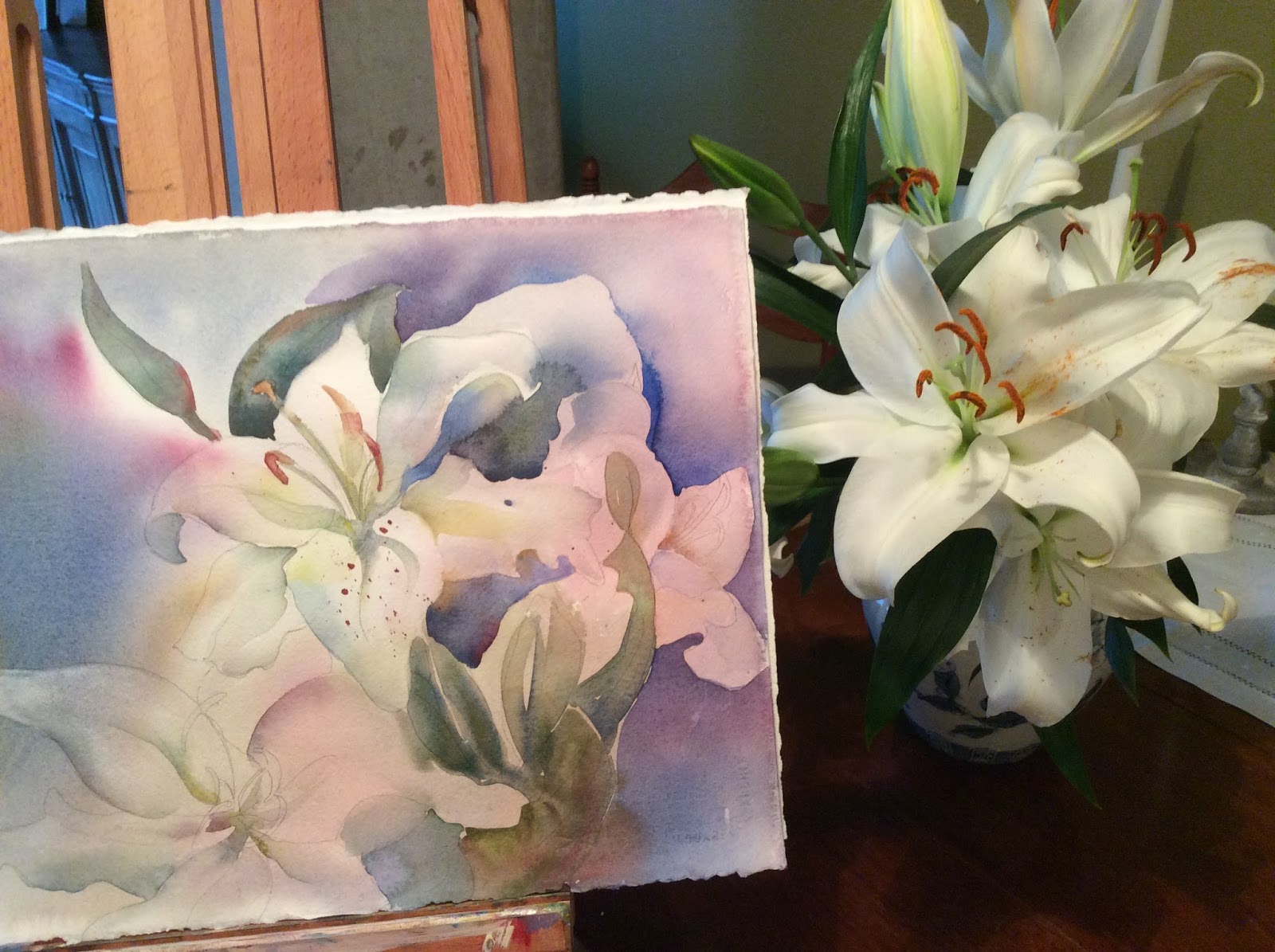
I enjoyed painting these lilies- A LOT! I think if there were only one type of flower to paint, this may be my pick. Everything from the color of the stamens, the messy flower edges, leaves, and whimsical patterns capture my heart and attention.
On this piece I  headed for a close-up of three favorite buds. They were completed without too much work; however,  I ignored planning the background. I KNOW better than that! After studying the blank, white background for a couple of days I decided to go in with a light, grey-blue gouache. What was I thinking?!? So, now that I'd killed the white of the paper (one of the 10 Commandments for a watercolorist) I realized this was a gonner. I tossed this painting into my 'stand-by' pile and moved on to my next victim.
After another painting or two I glanced back at this and decided to pull it out, experiment with dropping indigo and darker colors on TOP of the gouache and see what happened. I enjoyed the effect as the opaque gouache background acted almost like YUPO paper. Suddenly I had a 2nd chance with this piece. A few hours later this was my end result.
Lesson (that I've learned again and again): Some of my best pieces are the result of me totally giving up, walking away, then coming back with fresh eyes and energy.

Thursday, June 5, 2014

Picasso Meets VanGogh?

I took a day off of my painting schedule to…..paint! I belong to a fun online class of watercolorists (Create 38) and May's objective was to study the color of yellow (not one of my favorites). I started with good 'yellow' intentions but repeatedly leaned toward a more chosen color of mine - orange. LOVE ORANGE!  These sunflowers were from the Solvang farmers market and reminded me so much of a couple of impressionists I admire.
BTW, the online class is led by Vinita Pappas and is inspiring!

Tuesday, April 15, 2014

Glazunov's Sunset

I loved starting this painting, but finishing became a technical problem of sorts. My goal is to mesh both impressionistic and realistic painting styles. I'm not trying to photographically depict these florals, but give a mood- a feel of the flower's energy or essence. This is part of a floral series to be hung June 1st. Much of this painting is attributable to the classical music of Alexander Glazunov.

Tuesday, March 4, 2014

Almost ready to hang!


Two propped & finished paintings,  drying  before a final coat of varnish. Yeah! Sorry about the glare, I'm having problems photographing oils.  Both paintings 36X36; will be part of a series focusing on florals from Santa Ynez Valley.
The orchid painting was fun, learned many lessons. Can you tell which orchids I enjoyed painting the most? I got lost in YoYoMa and other classical music while painting this piece.
The Russian Sage was a new technique of distressing the canvas before starting to paint in oils. I collaged Asian or rice paper onto this canvas, then stamped and painted abstractly on this background. Finally painting the still life directly over this textured start. The finished piece has a lot of texture and mystery behind an impressionist type of painting. I'll do this again as it was a challenge but fun!

Friday, February 14, 2014

Valentine Moon


I wish I could do tonight's moonrise justice, but this is the best of my photo ability today. I was outdoors watering (don't tell my neighbors!) at sunset and the moonrise was ethereal. I dropped the hose and ran inside for my camera. Still thanking God for this moment.

Monday, January 6, 2014

A Winter Bouquet

It's been awhile, but here's what's on my easel. This was inspired by an online watercolor class that I belong to called Create 38. Each month there are challenges and assignments. This month's challenge was called 'Pathway to Spring'.
My challenge was to stay loose, have fun and give a feeling of warmth. I painted this with the help of Yo Yo Ma, Beethoven and Franz Liszt!
I enjoyed buying flowers, arranging them and painting for the last couple of days in a warm studio. I'm mentioning the 'warm' part as I've been thinking of loved ones in the Midwest right now with subzero weather. Crazy cold even for the midwest!

Tuesday, September 17, 2013

Quick Study of Orchids Listening To Jazz

Day Whatever.....OK, it's 17! I'm grumpy today; thought all night about my intentions for taking on this  challenge- and this is what I've concluded:

I'm noticing that sketches are time saving and meet with higher success day after day. I also need practice sketching and practicing time management when sketching and painting quick sketches- so that may be where I go from here.

Today's painting did help lift my mood. This was a 30 minute timed study: contour drawing of a bouquet of orchids that are in my studio. The colors were what spoke to me today. Enjoy!

Karen

PS I'm leaving tomorrow for a week so if I'm not able to download from my phone onto this blog I will put  the paintings on Facebook. 

Monday, September 16, 2013

Day 16- It's A Wash!

Well, this started with a wet wash anyway. It's after 10PM and I'm calling it quits on this beauty. Perhaps this can be saved, but not tonight. Boy, what does one write when it's a painting that's gone bad?  Sometimes this happens.

This was an assertive attempt at a busy scene. My plan was to lay in a wet wash of light and mid tone values. I wet both sides of the watercolor paper and started floating in color only to discover that I needed to leave for an appointment in 30 minutes (not enough time to finish the 1st wash). After a couple of more starts and stops I looked down at my paper and realized this train had jumped the tracks.

A scene like this needed undivided attention from the artist. Humbly, this is my product for Day 16.